
VISUAL ARTS

YEAR 10 VISUAL COMMUNICATION DESIGN
Design Elements, Principles and Software
Students have been busy exploring the Design Elements and Principles in a series of hand-drawn and digital exercises. Each exercise was carefully tailored to facilitate the development of students’ software skills using design industry standard programs Adobe Photoshop and Illustrator on a Mac platform and ProCreate on an iPad platform. Armed with an improved understanding of image resolution, colour modes and file management, students adopted a ‘trial and error’ approach to image manipulation, selecting source imagery and original photography to best communicate their intended design concept.
All students have refined their understanding of raster/vector graphics and are currently working on their final presentations, which aim to educate others about elements and principles. What is most affirming for me is their willingness to try and fail, then share their findings with peers. This ability to acknowledge mistakes as part of the process and keep moving forward is to be commended and is absolutely essential to success across the creative subjects and beyond.


There is such a positive and productive energy across both of these Year 10 classes as they learn programs used by industry professionals. I admire each student's ability to interpret the criteria independently and bring their own ideas and interests to the table. It has been an absolute joy to be a part of their process!
Ms Jessica Rogosic
Teacher of Visual Communication Design and Critical Visual Literacy
Throughout this term, we have been investigating the various elements and principles that formulate our subject. These design elements and principles have differing effects, which we have been creatively exploring. Elements are the basic building blocks of a piece, establishing all compositions. Examples being form, shape, and colour.
Principles refer to how these elements are used, with examples such as contrast, scale and balance. Using said elements and principles, we have been working with different design software such as Adobe Photoshop, Adobe Illustrator and Procreate, to accomplish three minor tasks that relate to elements and principles and help us develop a further understanding of them.
The final outcome of this learning task is producing an educational infographic representing and explaining the properties of two elements and one principle assigned to us at random. Creating a composition that simultaneously satisfied the educational and aesthetic aspects was quite challenging. Overall, I can positively say the build-up and creation of this task has further enhanced everyone's understanding of this subject.
Lulu Liang
Lulu Liang
Lulu Liang Year 10
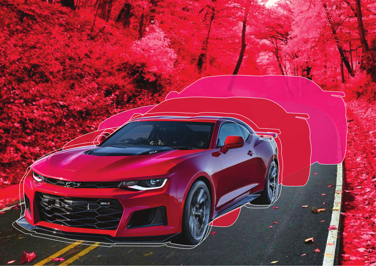
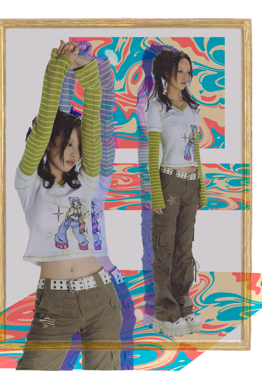
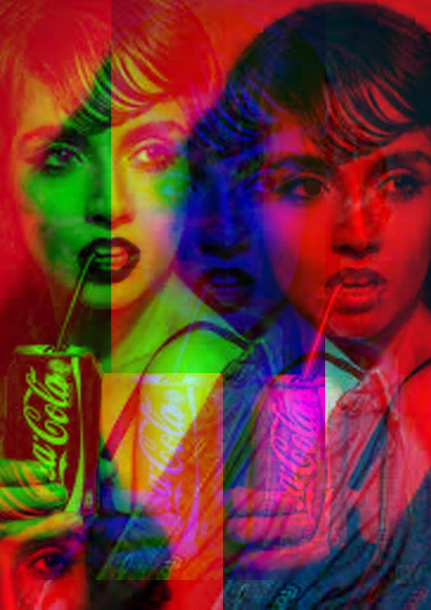
In these few weeks we have been exploring a few of the programs used in our Visual Communication Design subject. One of these programs is Adobe Photoshop, which is a raster-based platform which offers wide ranges of different tools used for creative image editing, compositions, website mock-ups and adding special effects to your work.
We also trialled other programs like Procreate and Adobe Illustrator to edit our work, however I found that Adobe Photoshop was the most convenient in letting us edit our images directly to meet the specific needs and expectations outlined in our layout sketches. The offer of many different tools helped make it easy for us to manipulate source images into what we wanted exactly. Using Photoshop on the big Apple Imac screen helped us to visualise it more clearly and more widely, making it effortless in enabling us to add vivid details and incorporate our plans and layout sketches into our work, almost making it an exact replica to what we had in mind.
Overall this program was very easy and enjoyable to work with, and people were able to handle this platform (and the other two programs) very easily on their first experience, making it fun and a new learning experience for all.
Aysha Shajan
Aysha Shajan
Aysha Shajan Year 10
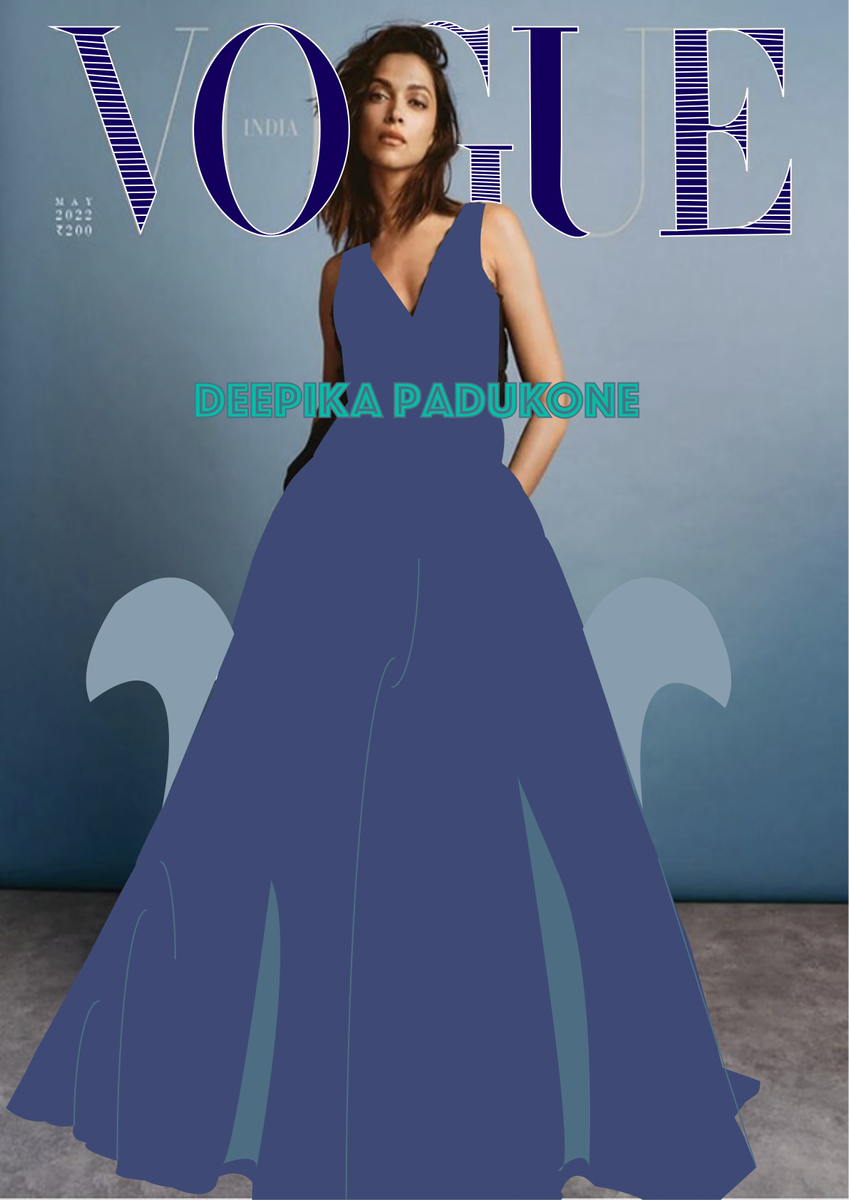
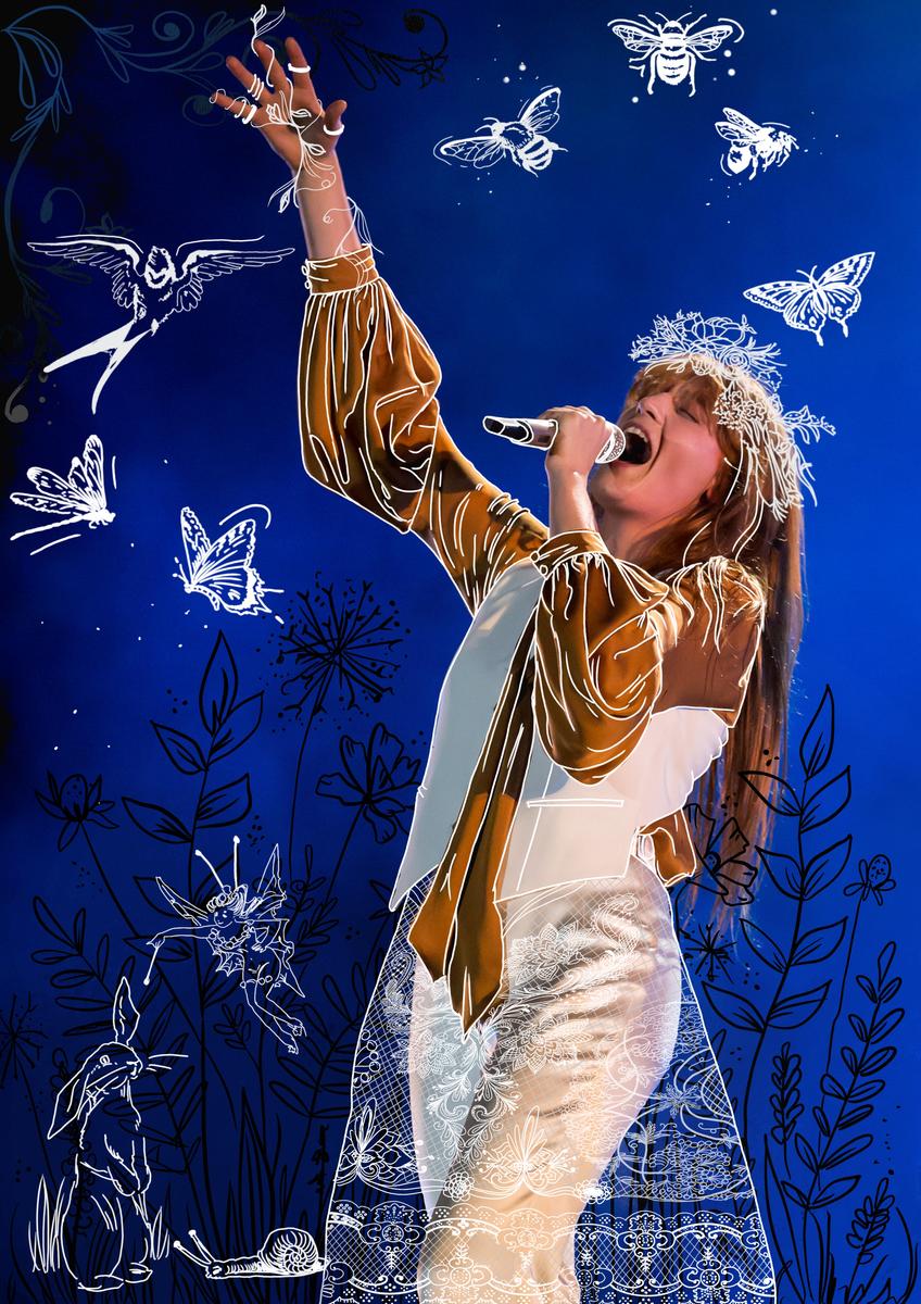
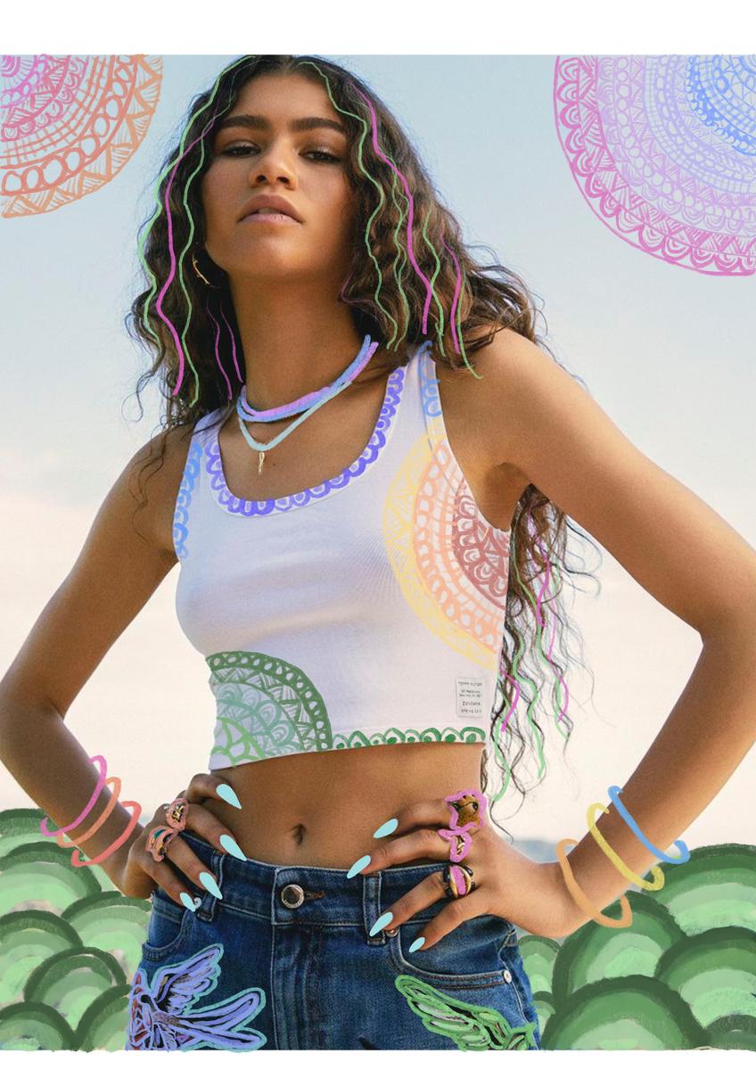
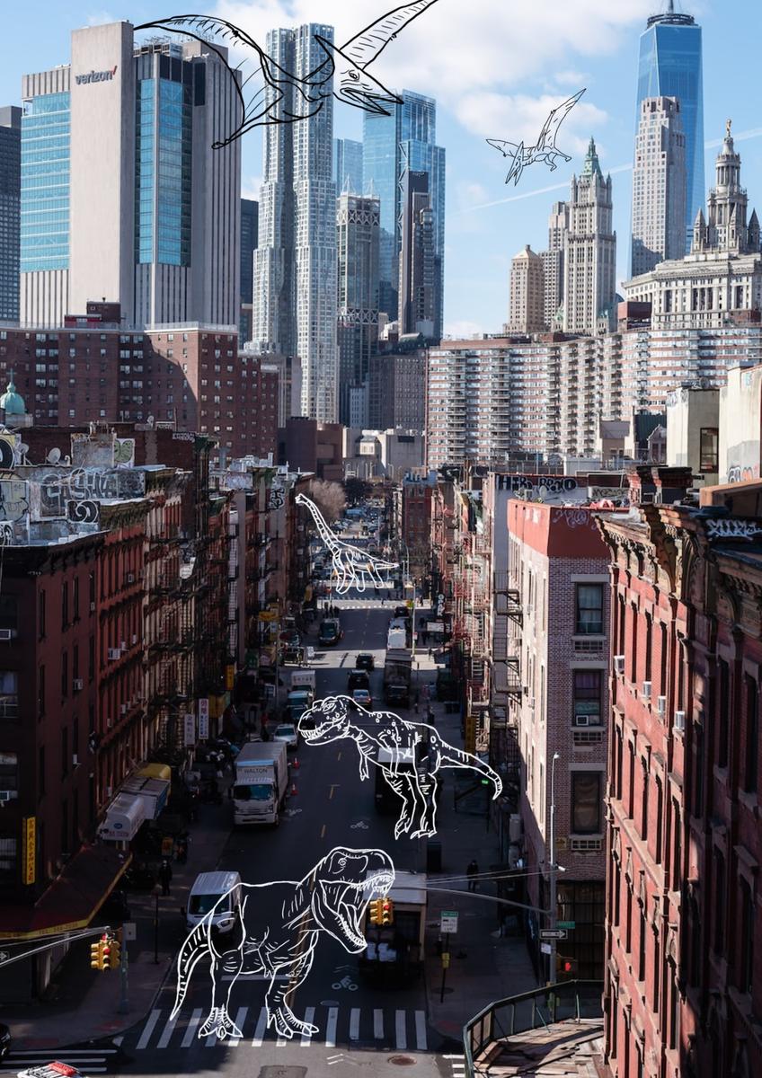
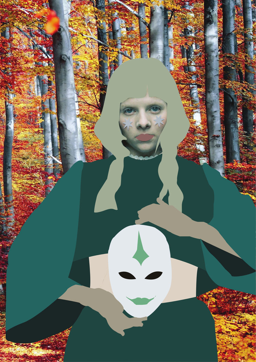
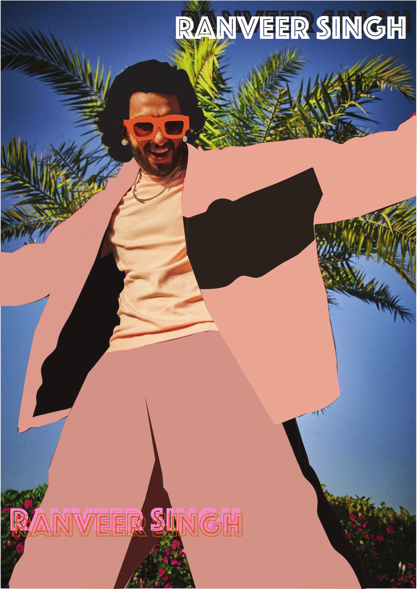
One of the programs we used for this task was Procreate, which is a digital platform, generally used on an iPad. When paired with an apple pencil, it can create a feeling like drawing on paper, except it is easier to edit, design, and draw your desired piece. While experimenting on ProCreate, we focused on the design elements of line and texture, and the principle of pattern. Many people chose to simply create line art over their chosen image, and some chose to make an entirely new outfit, with texture and pattern, over their chosen image. This style was inspired by well-known commercial iIlustrators like Ilias Waschofer, (AKA Dr Propolus), and Ana Strumpf.
Out of all the programs that we experimented with, most people found that Procreate was the easiest to navigate and understand. Not only was it the simplest, but also more hands on. Because of this, a majority of people chose Procreate as their main platform for their final Infographic presentation. Although Procreate is great for drawing, line art, and general design, it does not have some of the features from the desktop Adobe programmes, including editing tools, and this encouraged us to move from one program to another while creating our final Infographics.
Delilah Vlasak Galante
Delilah Vlasak Galante
Delilah Vlasak Galante Year 10
YEAR 7 DIGITAL VISUAL DIARY
Our new students in Year 7 Art have been doing an exceptional job recording their art making in their Visual Diaries and the digital version of it - the Digital Visual Diary. The Art Department already starts reinforcing in their junior years the importance of the Visual Diary as an essential tool for recording their creative research. This way, strong bases are set in their journey to become better artists.
Below, one of our outstanding Year 7 students tells us in detail about her experience recording every step of the creative process on her ‘Digital Visual Diary’ before she started working on her final painting.
Mrs Garcia
Visual Arts Teacher
This semester I started the Art subject. The first project we are carrying out is a landscape painting based on Jeffery Smart, David Hockney or Howard Arkley. We were to research all about these three artists and then chose the one that piqued our interest the most. Whoever we picked, our painting would have to be in the style of their works; Jeffery Smart having a moody and refined style, David Hockney having a detailed yet simple style and Howard Arkley having a bright and fun style. In my case, I chose Jeffery Smart.
We put all our research and progress into our ‘Digital Visual Diary’, which had guidelines for each page. When we chose our desired artist, we had to think about why we liked their work and what we could do that would fit their style and still interest us.
Once we had figured out a few ideas of what we could paint, we chose our favourite two and did a coloured A5 sketch of each idea. After that we put it in our DVD and then analysed what we liked and what we could improve on when we do our final A4 design in our sketchbook.
When we finished the final A4 design we took a photo and uploaded it again, this time explaining what we planned to do with the colours and techniques and how we would make it fit into our chosen artist's style.
Then, it was time to start our final painting, sketching it or tracing it onto the canvas board. Also, whenever we finish a painting session, we had to take a picture of our work for the progress slides on the DVD.
Art has been really enjoyable so far this term and I am really looking forward to seeing my final painting finished.
Kira Barnes
Kira Barnes
Kira Barnes
Year 7 Student