
Year 2
Maths
(Statistics and Probability)

Year 2
Maths
(Statistics and Probability)
Learning Experience Overview
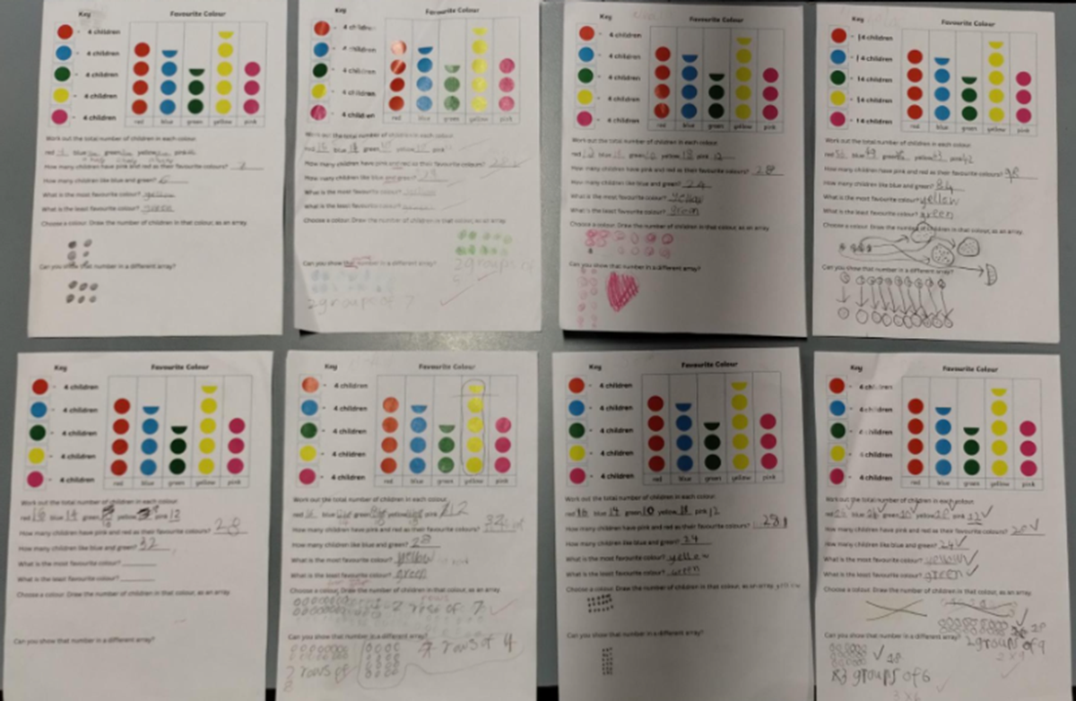
We considered what a pictograph in Maths, actually was - charts that use pictures or symbols—like fruits, stars, or dots—to represent and compare different sets of data. Each image in the pictograph stands for a certain number, which is shown in the 'key' or 'legend' of the chart.
Our example has the title, ‘Favourite Colour’, and shows data in dots, for five different colours, displayed in columns. The important point in the key is that each dot represents 4 children, so that half a dot would represent 2 children. This task was differentiated by changing the value of the coloured dots. Individually, students had to decide what strategy they would use to calculate the sums for each of the colours, and the final total – skip counting, repeated addition equations, multiplication.
Learning Intention:
To use the key to interpret the values in a pictograph
Teaching Strategy: Modelled
WHOLE
To begin with, we came together to break down the meaning of our Learning Intention. Students were asked to consider the meaning of ‘pictograph’, and what one might look like. The importance of the ‘key’ as a tool for interpreting the data, was explained. The Favourite Colour Pictograph worksheet was introduced.
Understanding the Pictograph:
SMALL
Students were given a Favourite Colour Pictograph worksheet. The task was differentiated by changing the value of the coloured dots, either increasing or decreasing, so that the outcome of each student’s pictograph values, would reflect that.
The questions on the worksheet require students to interpret the data, by answering questions about it, and comparing values.
Interpreting the Data:
WHOLE
We came together again, to reflect on what we had learnt about the data and what strategies we had used, to calculate the totals.
Extending Understanding:
Jocelyn and Steph
Year 2 Team