Year 4 News

From Georgia, Year 4 teacher
Year 4 students have written about their learning for this newsletter.
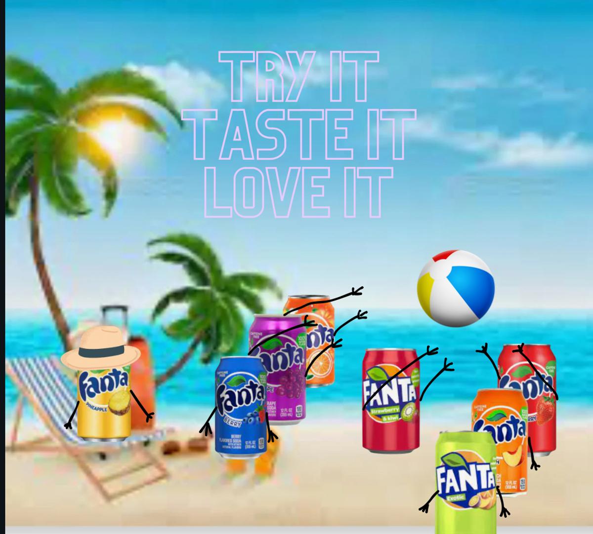
In Reading this term, our Year 4 cohort has been studying Visual Literacy and as a part of that, we got to create our own adverts. For our ads, we had to use some visual elements to make our ads more appealing to the audience’s optical sensors. The visual elements me and my partner used in our ad are typography and rule of thirds. Let me explain how we used them.
We used typography on our first ad to make sure that the audience read those words first. We also used it in our second ad to make sure that you read the word on the can first.
With the rule of thirds, when the main object crosses over the thirds, it means that the audience knows automatically that it is the main part of the advert and all eyes direct to the thing. We mainly used rule of thirds in our second ad so we know that the viewers understand that the can is the main part of the advert.
By Andrej and Raghav 4B
Sunlight is a made up sunscreen product that I made in Reading when we were doing visual literacy. Now this product has multiple visual elements such as contrast I have used this element by using a darker background and light text, I have also used juxtaposition by placing the text in spots that will catch your attention.
By Anton -4B
Some visual elements I used in my advertisement was size, colour and real life objects as I used the arms to attract attention to the cans and size to make people think that the Soda cans were big.
By Sanna -4B
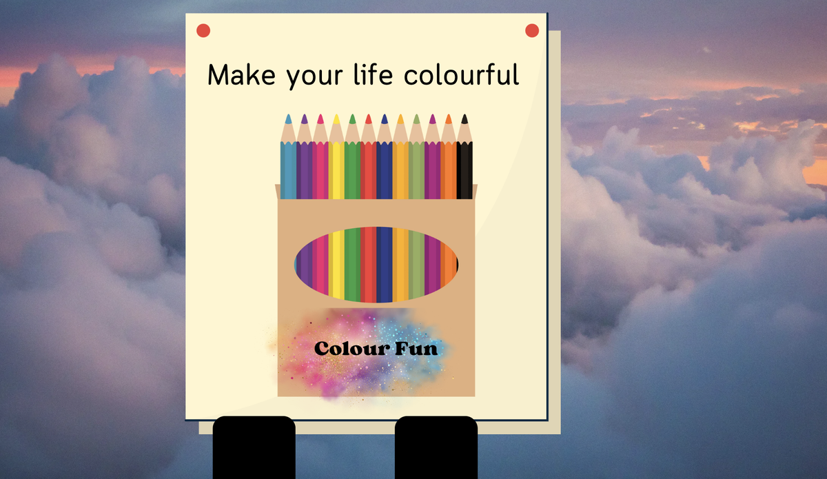
The coloured pencil add used bright colours and positioning to make the image stand out.
By Maya and Lakshmi -4B