Art
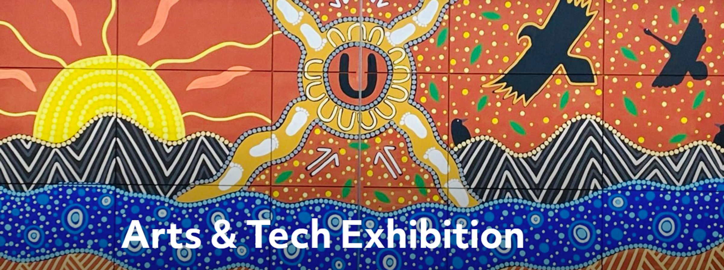
TOP ARTS 2026
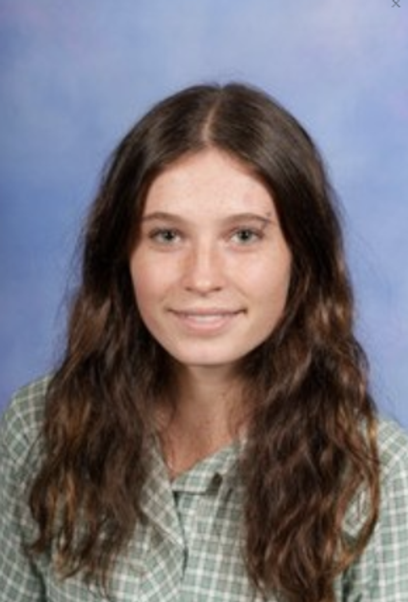
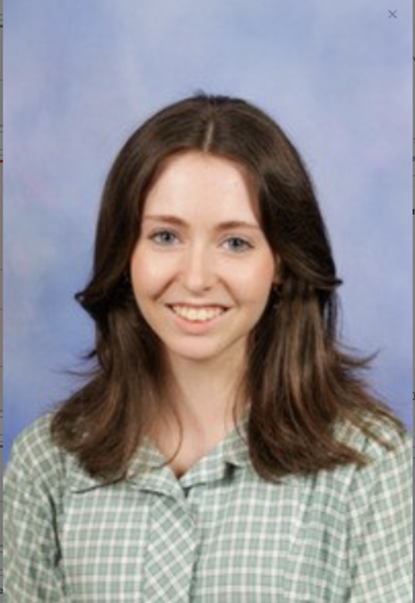
Shaun McKearny (Art Creative Practice), Poppy Nivarovich and Izzy Holland (Art Making and Exhibiting) were all shortlisted for Top Arts 2026, for their outstanding VCE finished artworks. This week each student delivered their Year 12 artworks and folios to Melbourne for the next round of selection. If successful, their artworks will be exhibited at the National Gallery of Victoria Australia, as part of next year’s Season of Excellence. We wish them all the best of luck and congratulate each student’s dedication to their VCE visual arts studies and artistic merit.
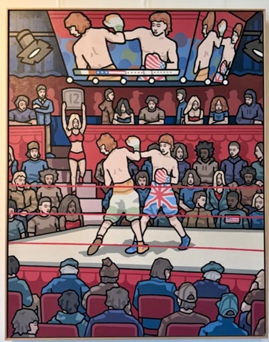
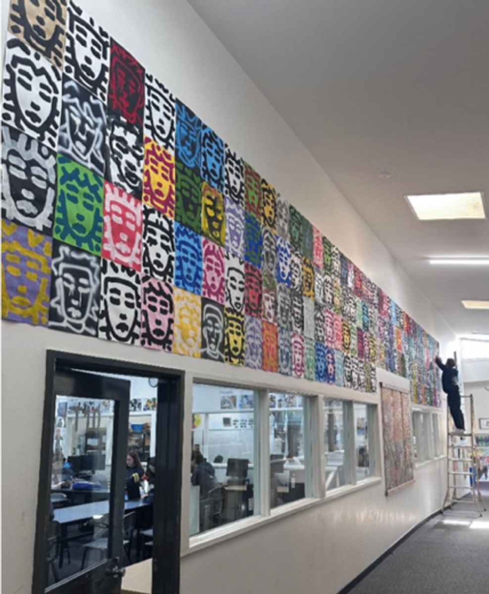
‘Me Vs Me’ ‘Faces that follow me’
Shaun was successful in being shortlisted for two artworks:
Me Vs Me, is a large-scale acrylic painting on board. Shaun depicts two versions of himself as boxers in a ring, one wearing American-flag shorts and the other Irish-flag shorts symbolising his dual heritage and cultural identity conflicts.
Faces that follow me is an installation comprising of 160 hand-painted faces. In Shaun’s words “The goal of this artwork was to boil my style down to its core features, leaving only the strongest parts of what makes it recognisable. In doing this I learnt my styles strengths and weaknesses, as well as what scale can emphasise in it”.
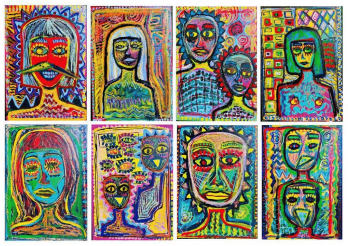
Poppy created a series of eight acyclic and oil stick on cardboard neo-expressionistic artworks called Birds and People. Poppy explains that ‘Through intuitive painting and energetic line-work, I explore the human form by moving beyond literal representation to capture a sense of emotional intensity. In this series, I chose to anthropomorphise birds, not only for their visual impact, but to reflect on the parallels between human behaviour and the often-brutal interactions observed in the natural world’.
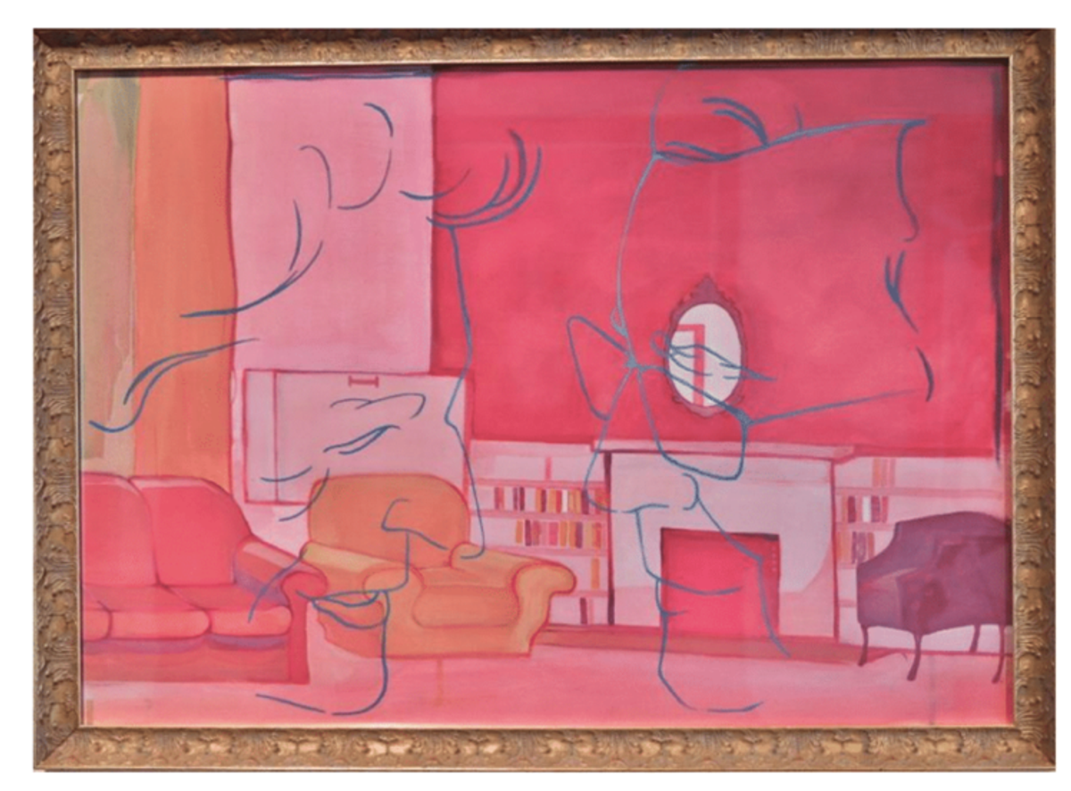
Izzy has been short listed for her acrylic painting on paper, with a golden ornate frame. Here painting Long, Long Time explores the nostalgia and memories tied to her grandparents’ house as her family prepare to sell it. Izzy explains “Each story shared by relatives inspired me to capture how the space has changed over the years, with every perspective adding another layer to a place I already know so well. The warm pink, contrasted with the blue outline of my grandparents’ faces, highlights the sense of absence in the home and reflects how the space has shifted for my family without them there”.